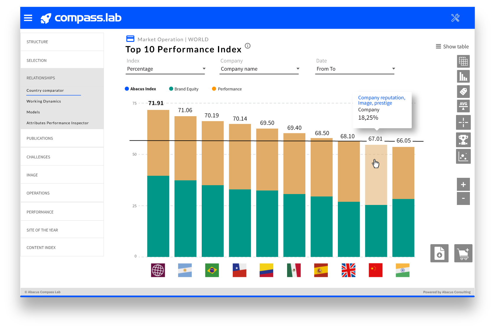
Abacus Visualization Tools
Main features of interactivity, user experience and usability of our dashboards.
TYPES OF GRAPHICS
Abacus Consulting has a visualization toolset that includes visualization templates, data integration APIs and models.
- Country comparisons
- Fever graphs
- Horizontal bars
- Vertical bars
- Index classifications
- Classifications of persons
- Clasificaciones
- Scattering matrices
- Area charts
- Spider or radar graphs
- Stacked column charts
- Tabulated information
FUNCTIONALITIES
Interactive menus
To select the information.
Transitions and effects
Interactivity and user experience.
Hide or show bars or fevers by clicking on keys (years, sectors…).
Explanatory buttons
To better understand the indexes.
Temporary filters and selectors
To sort data, change dates or select new sets.
Tools
To work with visualizations
Color hierarchy and keys
Order in the visual information.
Data download
In CSV or Excel format.
File download
In PNG or PDF format.


