Business Intelligence: Dashboards to impact the enterprise
We create real-time, cloud-based dashboards to convert information from surveys and studies into impact and better analyze your KPIs.


We create real-time, cloud-based dashboards to convert information from surveys and studies into impact and better analyze your KPIs.
BUSINESS | VISUALIZATION | GRAPHICS
We look for the best way to visualize your company’s information. One of our clients had a large database of agencies and companies around the world and had accurate KPI studies. We developed an interactive application to consult the data and visualize them in a clear and precise way.
The company, dedicated to market research for agencies and companies, needed a tool to visualize the information of a dozen KPIs, stored in an internal database, and be able to offer it to its customers digitally.
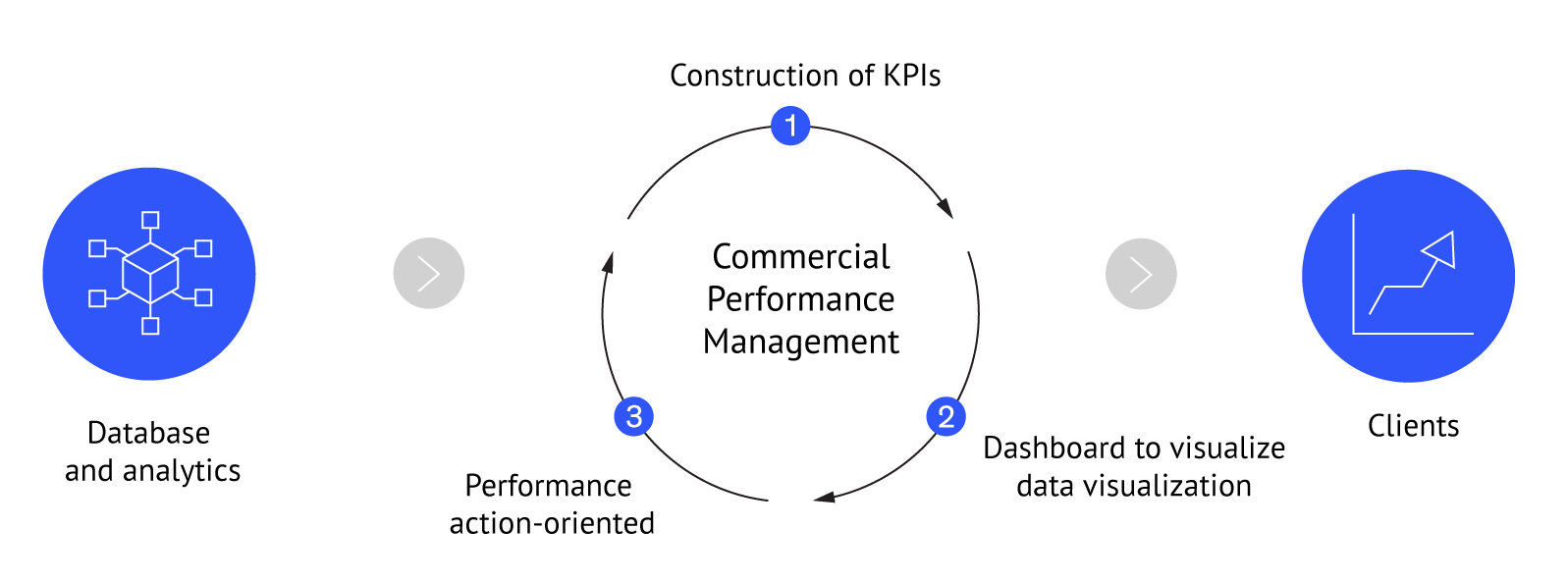
The company’s studies generate hundreds of indicators in multiple dimensions and markets, resulting in high complexity for use and analysis. Abacus Consulting will aim to subtly reduce complexity and achieve clear exposure and communication to transform the value of visualization into new insights for the client.
Abacus Consulting proposed the design and parameterization of a visualization platform adapted to the needs of the company to serve as a basis for the incorporation of future needs. The source of the data came from hundreds of surveys and studies conducted over time by the client.
The methodology used for the development of this business intelligence solution consisted in the collection and analysis of all the information coming from the company’s surveys and studies. A solution was developed in the following stages:
Main features of interactivity, user experience and usability of our dashboards.
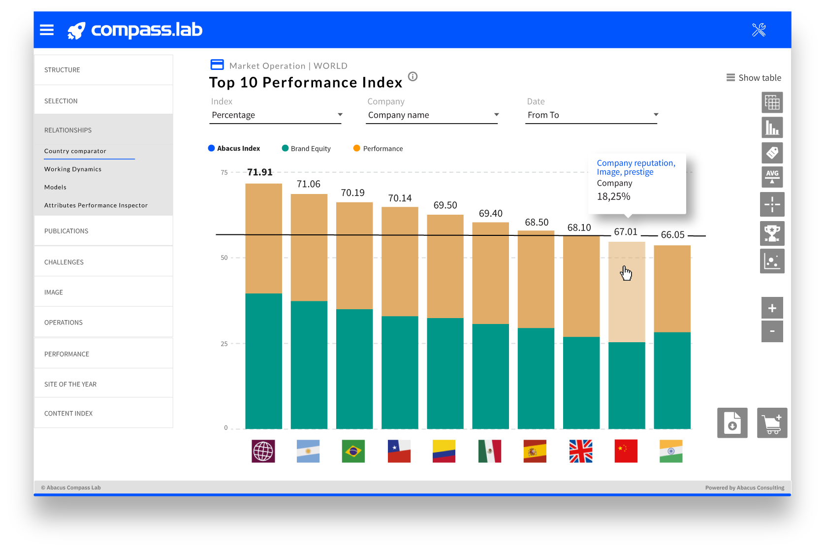
Abacus Consulting has a visualization toolset that includes visualization templates, data integration APIs and models.
To select the information.
Interactivity and user experience.
Hide or show bars or fevers by clicking on keys (years, sectors…).
To better understand the indexes.
To sort data, change dates or select new sets.
To work with visualizations
Order in the visual information.
In CSV or Excel format.
In PNG or PDF format.





|

|

|

 Geomarketing: Customer typologies